|
Many people use there phones for pretty much everything, but many people also use their desktop and there is a lot of differences between the two. For example, the screen size. A website or app needs to condense to the size of the mobile device the user is using at the present moment, when a desktop has a big screen and can show the website or app in a more wide, less cramped-looking way than a mobile device. Another difference is the way we navigate our way through apps and websites, when using our mobile devices we use our fingers to scroll, click, press, and move around the website or app. A desktop uses a mouse or a touchpad to navigate. In the end it really is up to the user in which device they prefer, some will prefer a desktop or some will prefer a mobile device. 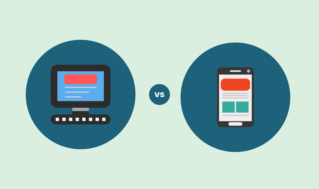
0 Comments
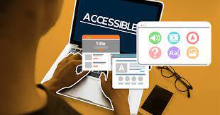 What is Inclusive Web Design? Well designers must guarantee can visit their website without any problems, in other words it's simple to use and unsure that the user's task is completed. There are many ways you can make your website more accessible for your customers, but here is three of them that I think are important.
2. Optimize Colour Contrast The degree to which the colours of two design elements stand out from one another is known as colour contrast. There is a minimal ratio to shoot for, and the unit of measurement is a ratio. Assuming that various design elements meet the WCAG's minimum colour contrast ratio, we not only enable readability for visually-impaired users, but we also improve it for those who aren't. This is just one of the many ways we design inclusively with little effort. Ways we can fix this problem is by using colour contrast analyzers, these can help a web designer correct the colour contrast and to see if it's the proper contrast for different types of users. 3. Help Users Fix Mistakes Mistakes frequently create a cloud of confusion, especially when the user is unsure of what they did or how to correct it. Mistakes are unavoidable, which is why assisting users in overcoming their errors is critical to inclusivity. Understandably, filling out forms is the most frequent situation in which a user could miss, and this frequently happens due to a range of disabilities, such as trouble understanding due to a cognitive disability, improper data input due to a motor disability, and so forth. Things we can do to fix this is always use form labels to describe input fields, enable autofill and autocomplete to reduce typing requirements, and display form errors very clearly. Although this has a delicious name to it, I will not be talking about the food but the tool that web designers use, The Hamburger Menu. The Hamburger Menu is type of tool that helps you navigate your way around apps, websites, and programs. It's made up of three horizontal lines that resemble what a hamburger looks like, its , main purpose is for space-saving. I think it's a great way to save space for the more important matters, and if I were a web designer I would put this tool on my website. I think most web designers use this tool to there websites doesn't look too crowded, it's also a great way to keep your website clean and organized. 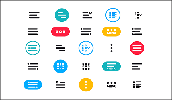 |
